| Thread Previous • Date Previous • Date Next • Thread Next |
Hello again gtg people,
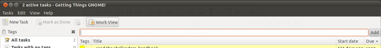
I've been thinking on how to improve the ui of the main browser (the
upper part in particular). The current ui is attached in Screenshot.png
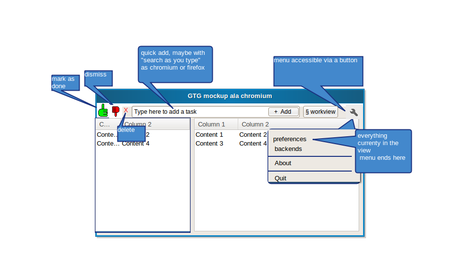
We could steal some idea from the chromium project, as I've badly
sketched in the attached mockup.png
The idea is to:
- get rid of the menu bar, and use an icon to access a simplified
version of the menu
- give more importance to the quick-add bar: it is now the main way to
add a task from the browser. A search-as-you-type feature would be cool
- remove the text from the dismiss/delete/complete buttons. Reasons:
- It creates problem with some translations (the german have
surprisingly long words)
- a very good icon shouldn't need a text to explain it -- the icons
in the mockup should be thumbs-up-hand/thumbs-down-hand/red-cross, and
are just an example.
- the only other button the user need to care about is the workview
one. eventual plugins
buttons (e.g, hamster) would be inserted after the quick-add text box.
- i'm also thinking that, with such an ui, it would make sense to have the
preferences and the plugins as two separate entries in the menu.
The net result would be having a simpler ui and more space for the
tasks/tags list
What do you think?
Attachment:
Screenshot.png
Description: PNG image
Attachment:
mockup.png
Description: PNG image
| Thread Previous • Date Previous • Date Next • Thread Next |